As It’s Written
As It’s Written is a theatrical play written by Caroline Hull and was performed as part of UCF Celebrates the Arts, an annual university event held at the Dr. Phillips Center for the Performing Arts in Orlando, FL. The production was later remounted in its entirety at Penguin Point Playhouse in Oviedo, FL.
I was tasked by the show’s director to design a logo that communicated the show’s visual aesthetic and themes.
Type
Logo Design
Year
2022
Concept
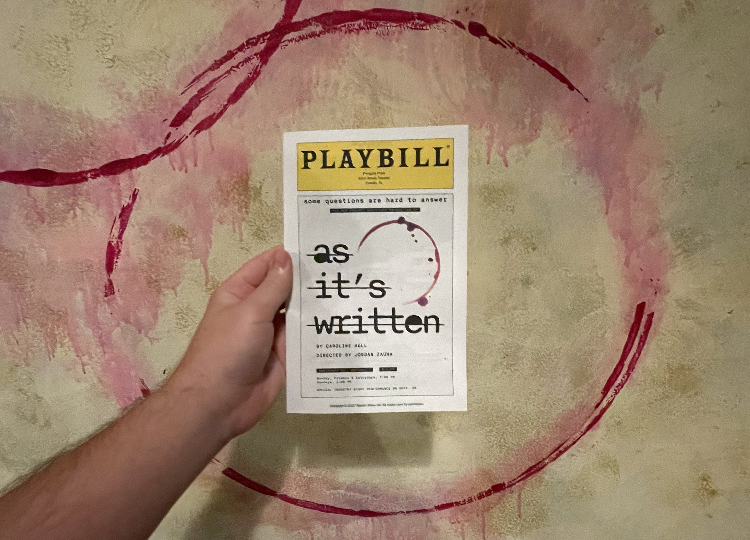
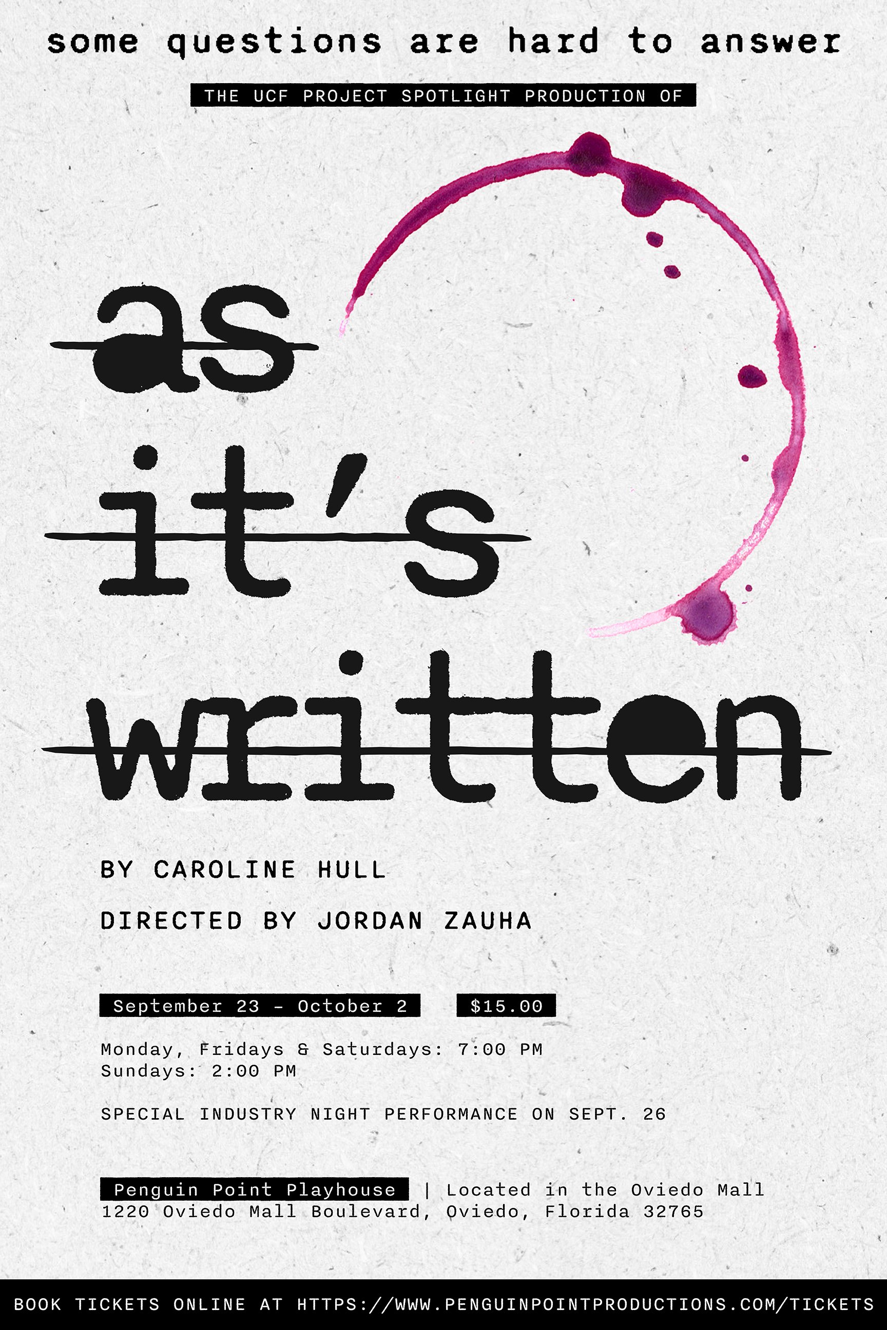
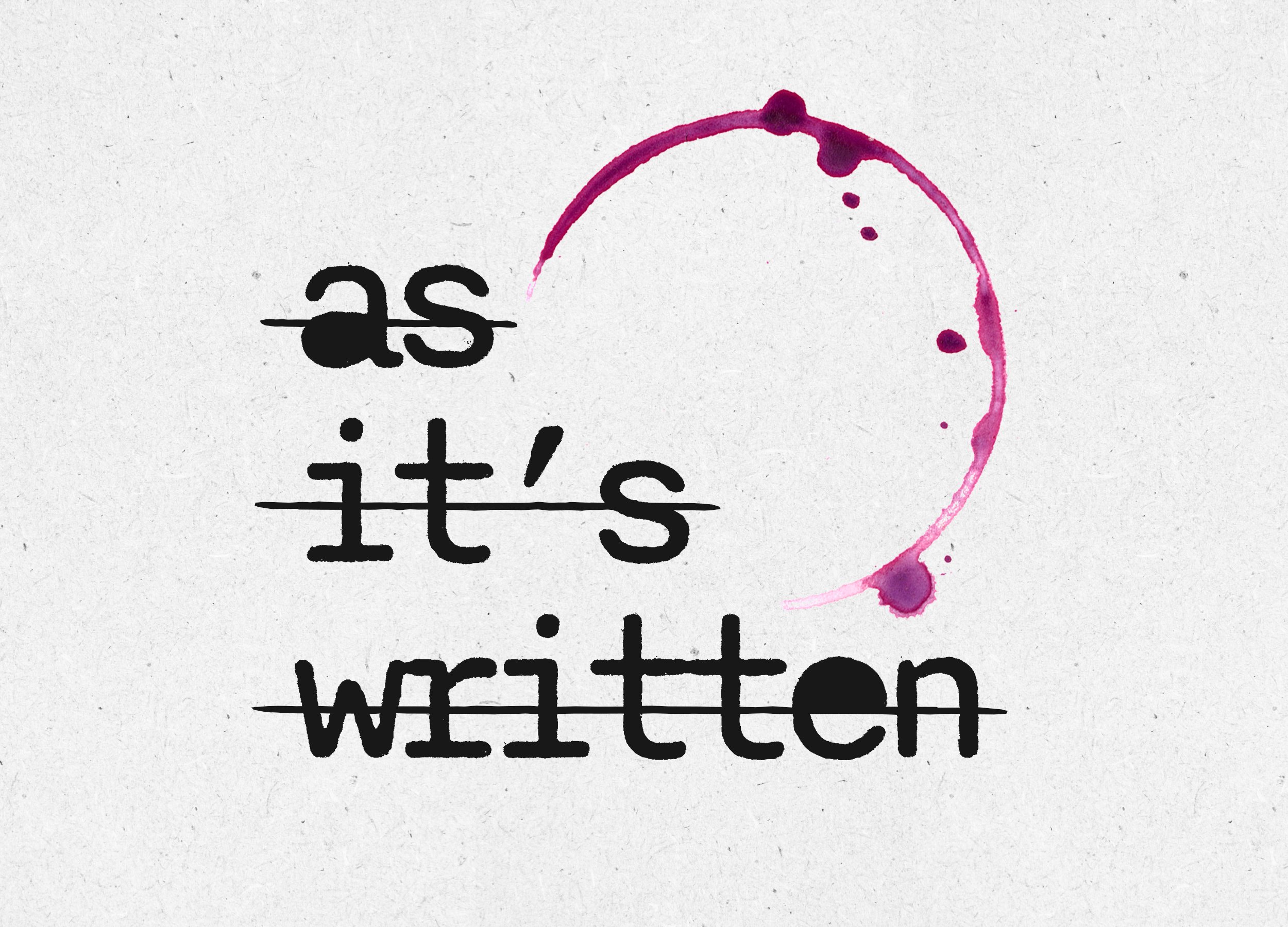
As a queer person myself and with my career origins rooted in theatre, this was a special project for me. On its surface: the design draws upon the main character's complicated creative journey (and betrayal) of discovering herself, while showcasing a playful nod to the protagonist's love of drinking wine.
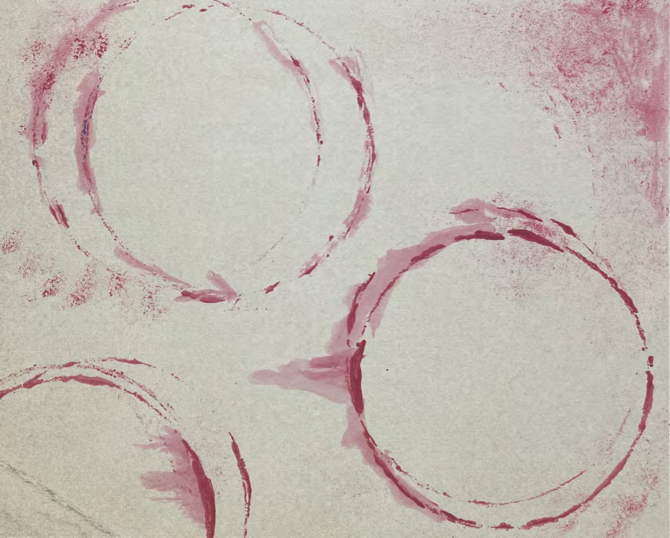
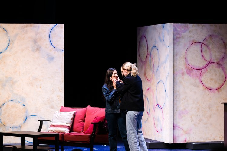
As part of the play’s set design, five moveable flats were painted to look like parchment with rings of purple, pink and blue hues.
From this inspiration, the logo depicts an incomplete wine stain, representing the "missing piece" feeling shared by many queer and questioning individuals. The lowercase typewriter font and its strikethrough represents the struggle of self acceptance and acts as a nod to the two main characters' writing professions and conflict.
Color + Type
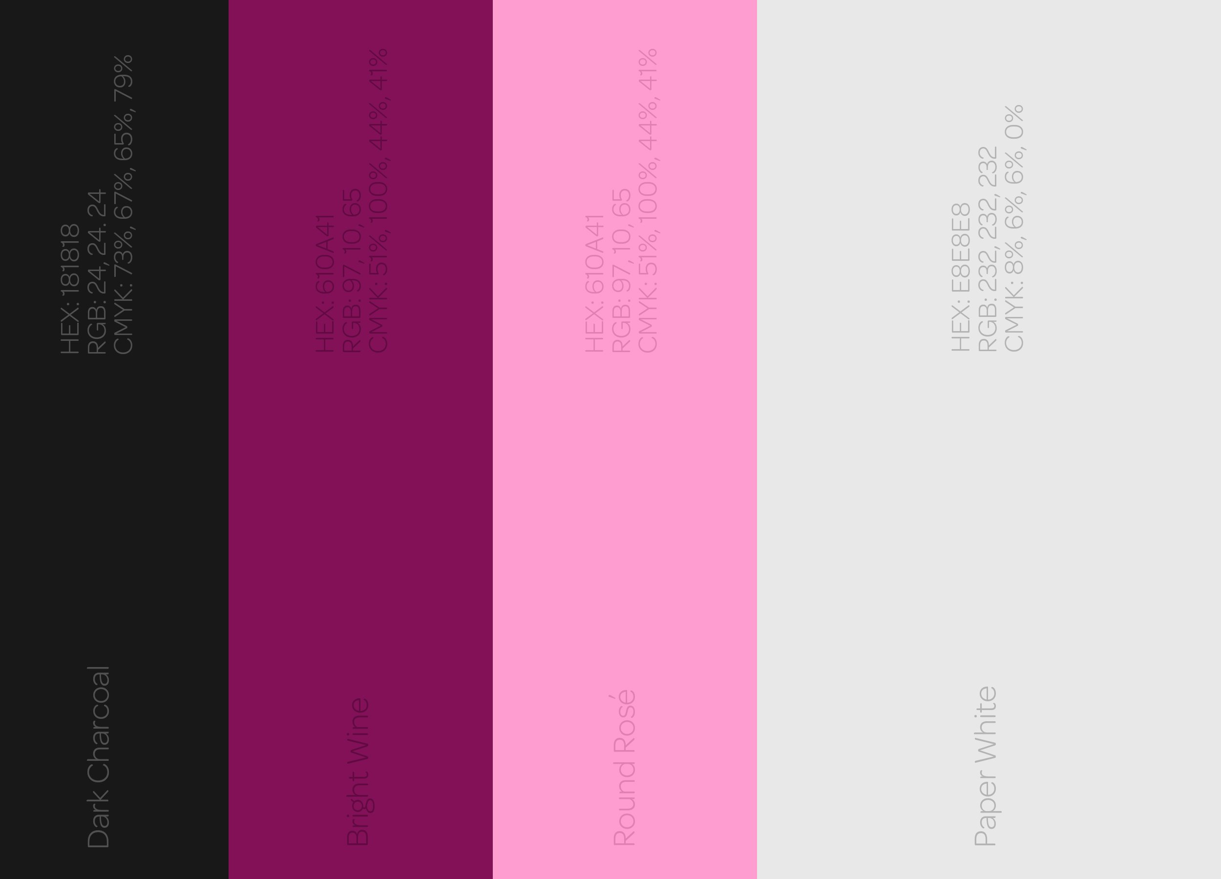
Keeping the color palette simple was paramount in an effort to advertise the show and communicate poster/playbill information. Dark Charcoal and Paper White were chosen to bring forth the concept of writing while the remaining Round Rosé and Bright Wine were inspired by...well, wine.
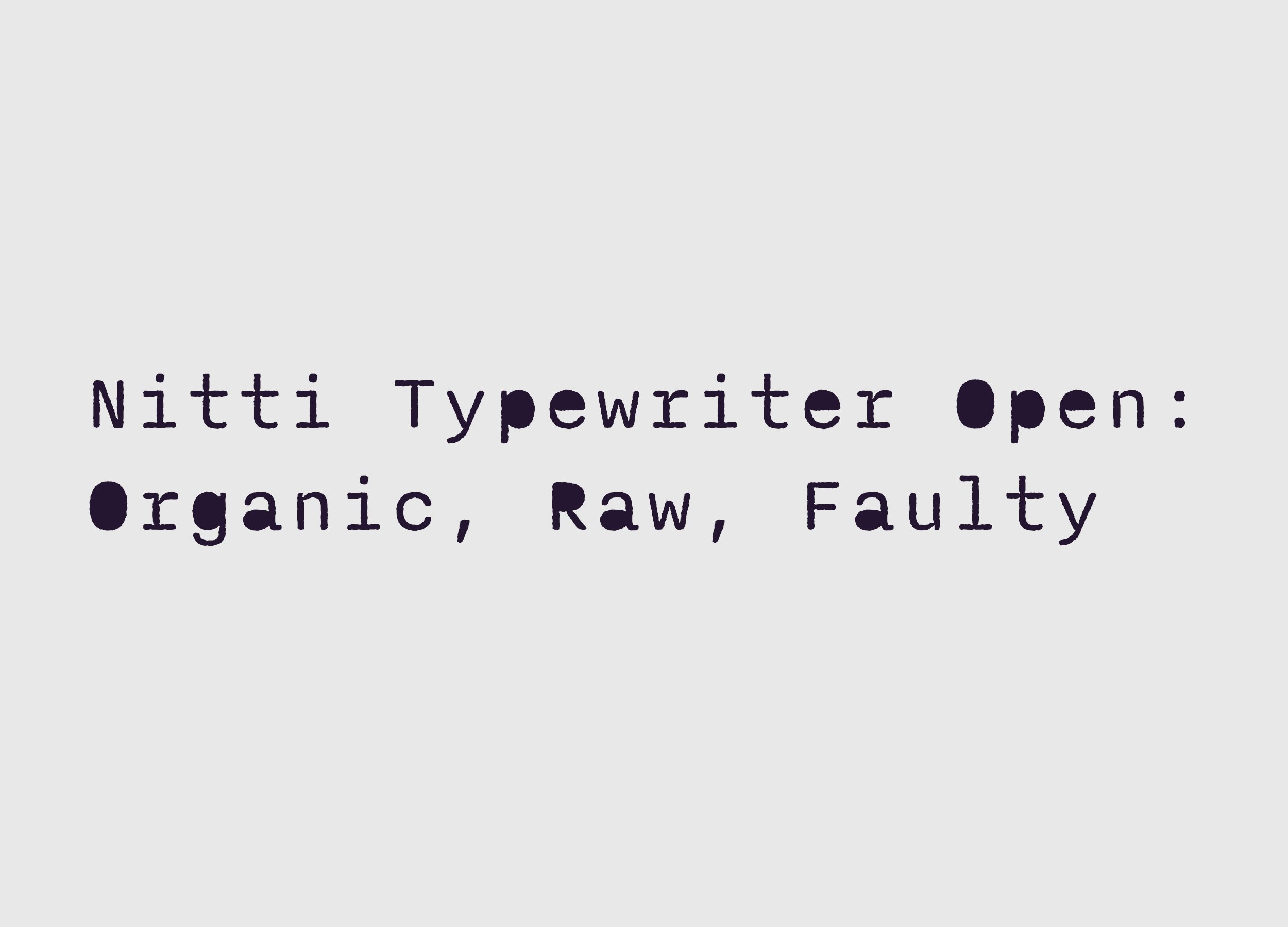
The Nitti Typewriter font was chosen to mimic common fonts used for screenwriting—a pivotal plot point in the story. Using the “Open” variation of the font also expresses the raw and faulty nature of humanity and the main character’s journey. Lastly, the strikethrough hints at themes of erasure touched on in the story's major conflict.