Amy Sapp
Amy Sapp is a freelance Producer, Digital Marketing Guru, and Concert Programming Director based out of Nashville, TN. The goal was to deliver a cohesive, bold, and streamlined design to a multi-hyphenated individual who wears many hats, allowing any potential client to immediately get a sense of who she is and what she does by making a design statement.
Type
Personal Branding
Year
2020
Concept
Starting from scratch, the client and I sought to uncover a unique original design that truly reflected her personality and vision.
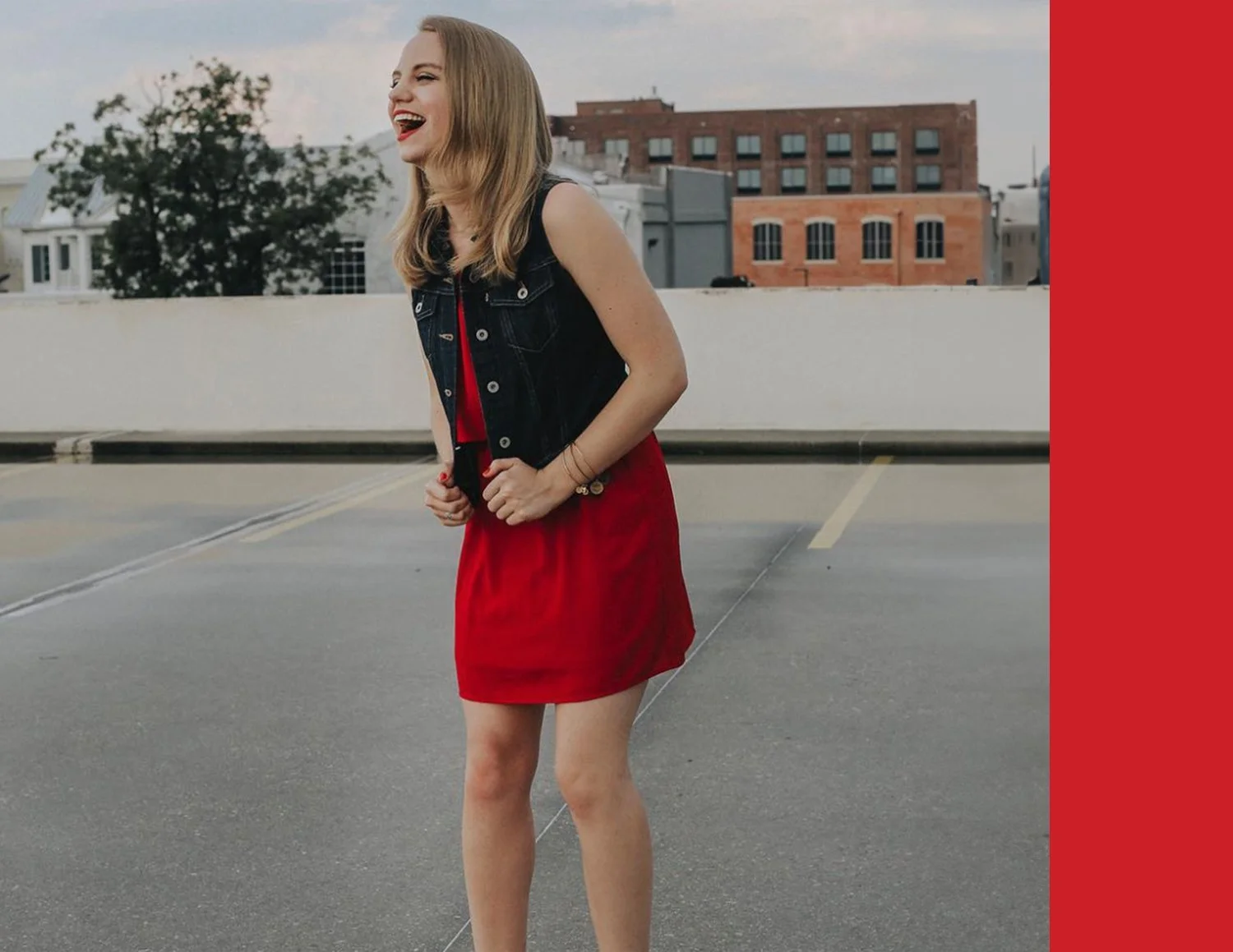
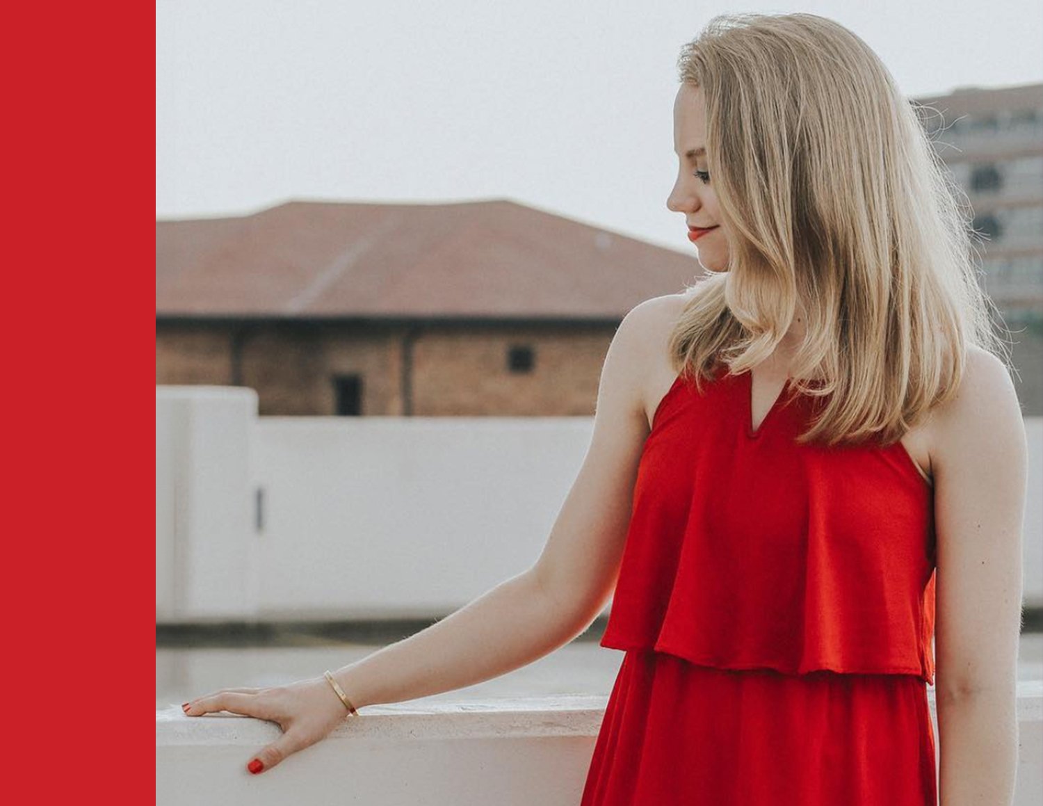
During consultation, Amy came to the table with photography by Sarah Cagle as the basis for visual assets for her new brand identity. Amy is pictured wearing a bold red dress with her signature red lipstick and red fingernail polish. I knew immediately that these details would be the inspiration behind the design.
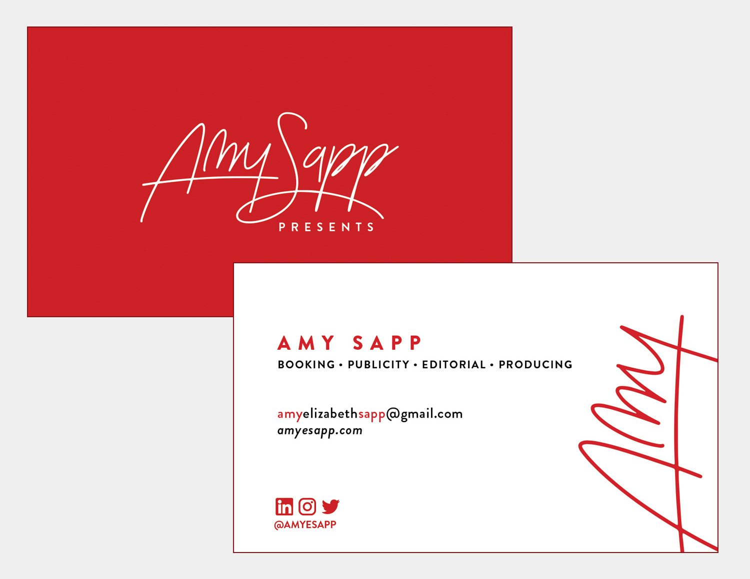
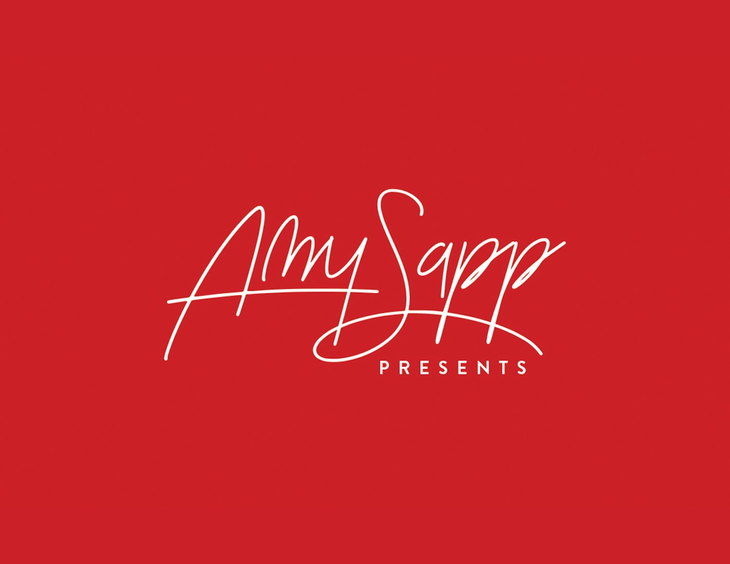
To humanize the branding, we decided on a wordmark, using a modified signature font just as striking as the red.
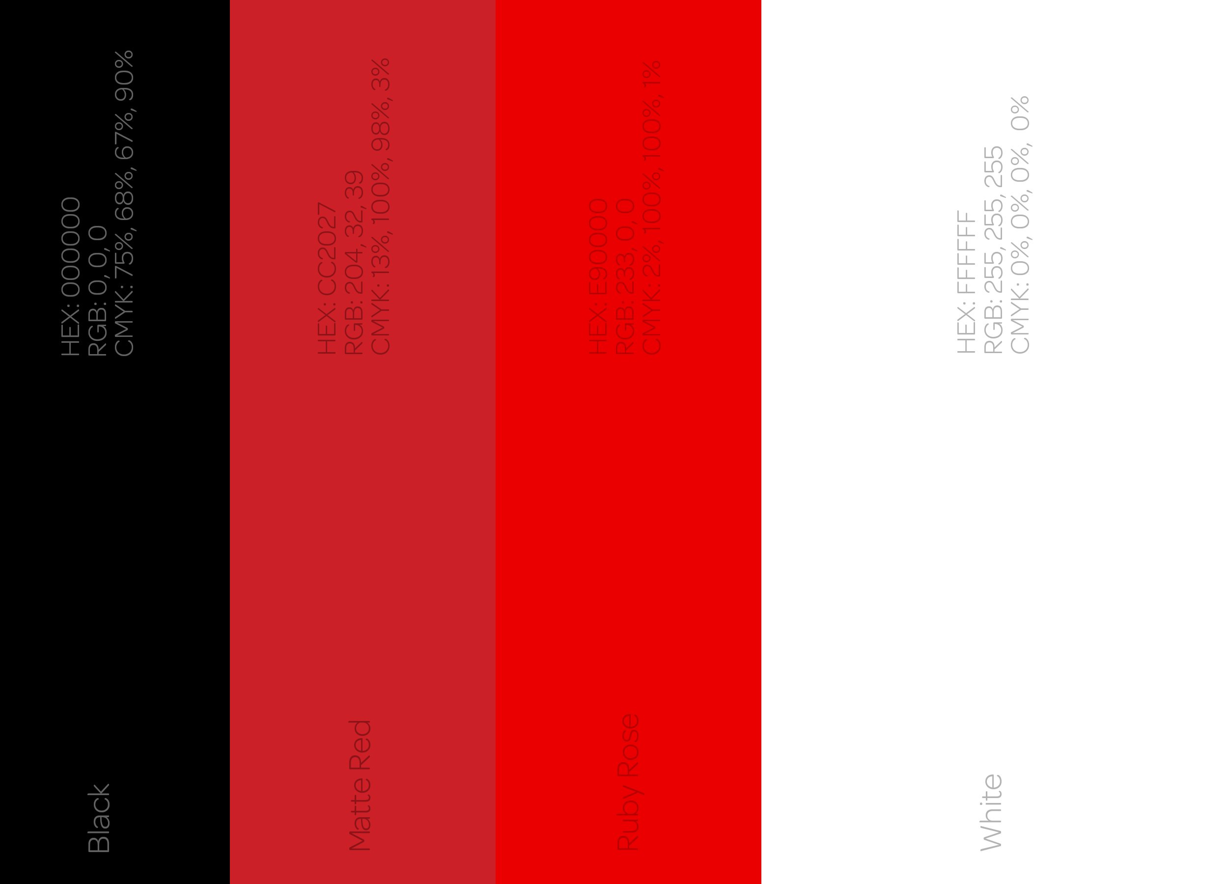
Color + Type
Black and white and red all over! Two reds were chosen for use in print vs. digital design, as well as ensuring that a slightly muted tone of the bright red wasn’t overwhelming when scrolling through a website or various media assets.
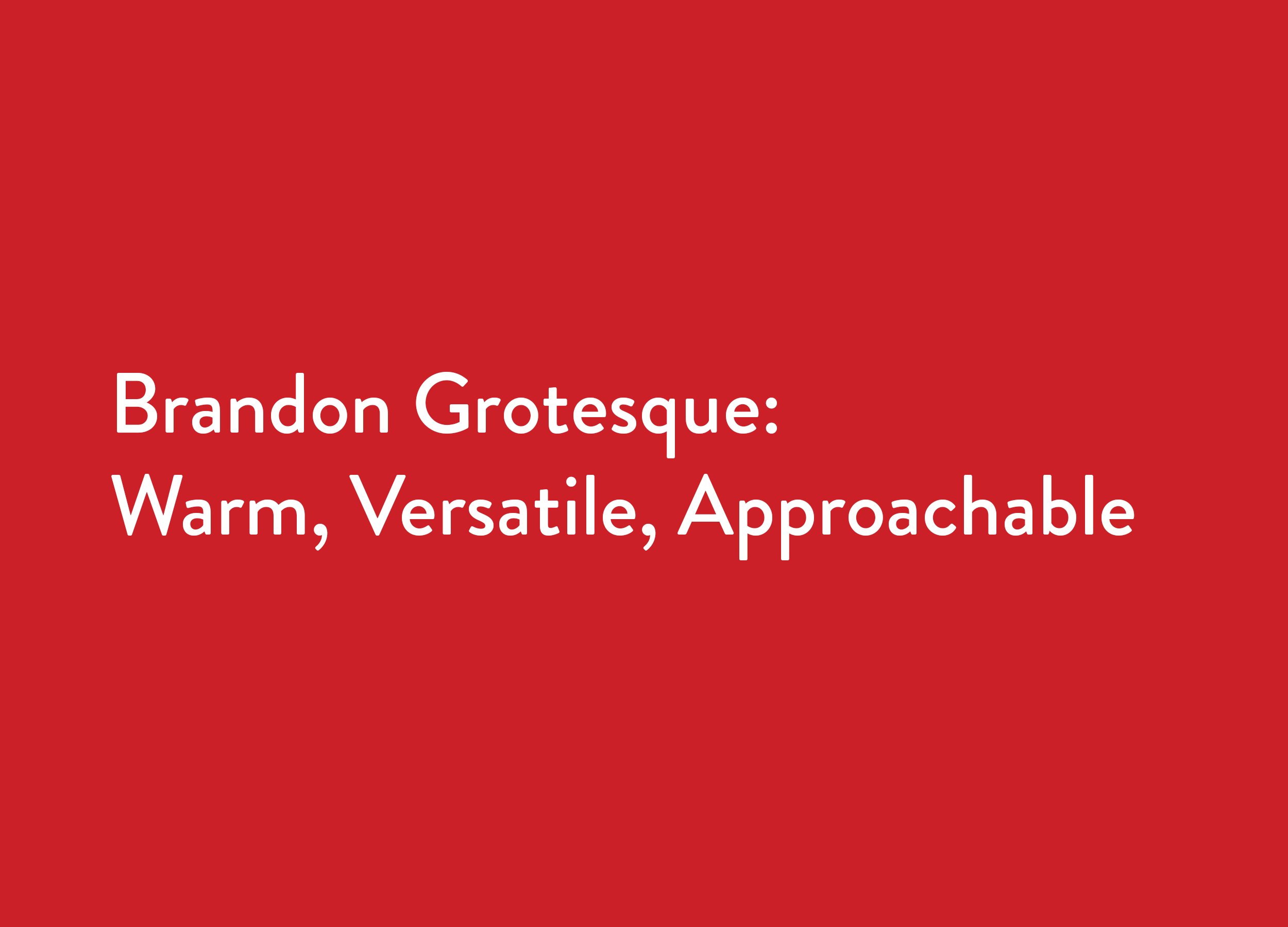
I knew that I wanted to pair the word mark with a simple sans serif font for both the main design and in other collateral. Brandon Grotesque was the selected font, as it draws inspiration from the geometric sans serif font faces that were utilized throughout the 1920s and 1930s—an inspired period of time for design, including the use of Art Deco and its impact on sleek, streamlined graphics.